The Error in Wikipedia's Logo
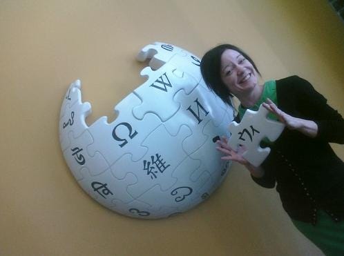
This week Jennifer 8. Lee, the improbably-named former NYT reporter, is visiting the Silicon Valley. Yesterday she posted this image taken at the Wikimedia Foundation in San Francisco:

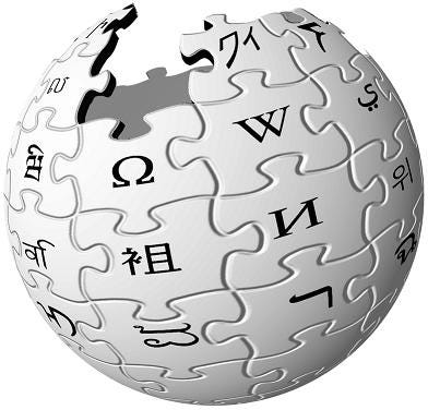
That's some pretty cool Wikipedia wall art (and certainly less controversial than Wikipedia Art). Yet the first thing I noticed about it, oddly enough, is that this logo is correct. What do I mean? Take a closer look at the actual logo currently in use on Wikipedia:

Notice what's different? The Japanese characters held (not by Lee) in the above photo are different from the characters in the official logo. As someone who took far too many years of Nihongo to be unable to speak the language, I'm still pretty good with its phoenetic alphabets (it has two). In this case, we're talking about Katakana, the alphabet reserved for spelling words of non-Japanese origin like, for instance, Wikipedia.
Japanese has no single character representing "Wi" but this is accomplished by putting the "U" and "I" sounds together. The latter character is made smaller to indicate it is not sounded out in full but rather modifies the preceding character. That basically makes it "Ui" and is spelled like this: ウィ. The full spelling of Wikipedia, then, is ウィキペディア. Another reason I know this: because my first name is spelled: ウィリアム.
The Wikipedian who designed it made a fairly simple error, substituting the character for "Wa" which looks like ワ -- or possibly "Ku" which looks like ク -- which is a simple enough error to make in the first place. But isn't it simple enough to fix? Maybe not. There are many, many language-specific logos in use on the front pages of many different Wikipedias which would also need to be fixed.
Although infrequent updates have been made to the original file, none have changed its appearance. This problem is occasionally brought up on the Talk page associated with the file, but as yet no one has taken the effort to fix it. And there's another problem: that may not be the logo's only mistake. One of these days -- or weeks, or months, or years -- someone will probably getting around to fixing this. And chances are you won't notice that, either.
N.B. The Wikipedia logo as we know it today was chosen in an international contest in 2003. To see all of the versions which didn't quite make it, click here. For more information on the evolution of the Wikipedia logo, click here.
Update: Funny, though, that several of the other symbols on the wall at Wikimedia HQ are also different from the logo in widespread use. More TK.
Via @aminatou. Photos courtesy Jenny 8. Lee and Wikmedia.


